
Standardising CVSS Scores Across the Platform
This security platform displayed CVSS (Common Vulnerability Scoring System) scores in multiple inconsistent ways across different products. This created confusion, reduced trust in the data, and made it harder for security teams to assess risk accurately.
I led the design proposal to define a single, standardised, scalable pattern for how CVSS scores should be presented across the entire platform, supporting multiple CVSS versions, improving clarity, and future-proofing the UI for upcoming standards.
Industry
Cyber-security
Year
2024-2025
Background
Through internal review and product audits, alongside conversation with users, I independently identified several critical issues in this area:
CVSS scores were displayed inconsistently across products.
Users often couldn’t tell which CVSS version they were looking at.
Vector strings were sometimes missing, reducing transparency and trust.
With AI-generated CVSS scoring being introduced, there was no clear way to explain how scores were produced.
Tables and layouts were becoming visually cluttered as more CVSS versions were added.
The Impact
This directly impacted:
Users’ ability to prioritise vulnerabilities
Trust in the platform’s security data
The platform’s perceived reliability as a security decision-making tool
Slides from my pitch presentation to all senior members of the design team and relevant stakeholders: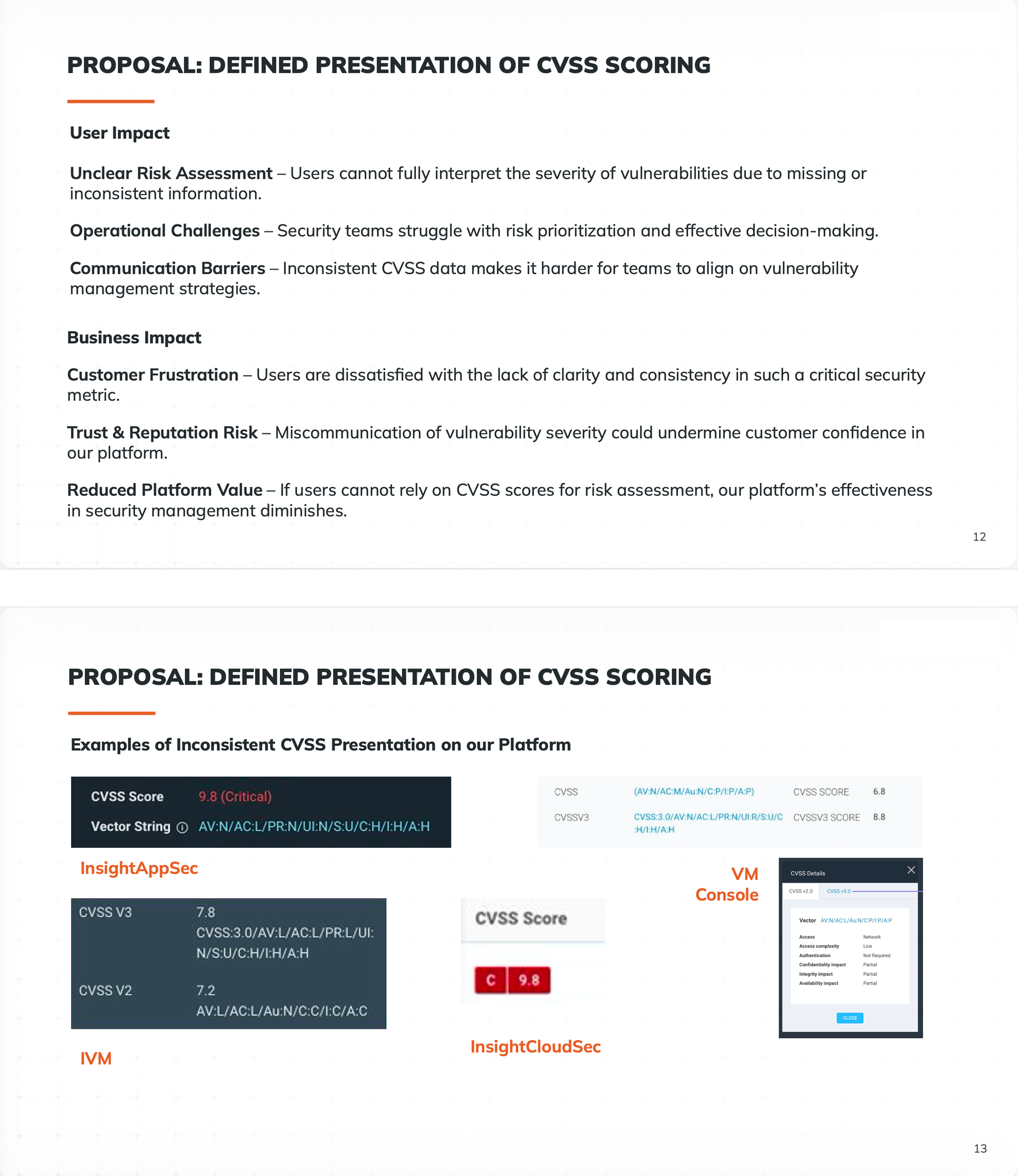

The Process
For this project to be successful, I had to create a clear, consistent, and scalable way to present CVSS scores across all products that:
Always shows the most relevant CVSS version by default
Allows users to access older versions and vector strings
Clearly communicates how the score was generated
Reduces UI clutter
Works for future CVSS versions without redesigning layouts
Allows scalability for AI enhanced scoring and disclosure
The Goals I Established:
After identifying the cross-product UX inconsistency problem, I:
Defined the global design pattern
Designed the interaction model and UI pattern
Brought the proposal through Design Forum of all senior members of the design team and relevant stakeholders for review and approval
Aligned the solution with design system standards, accessibility, and engineering constraints
Ensured the solution would scale to CVSS v4 and beyond, along with AI scoring
My Approach
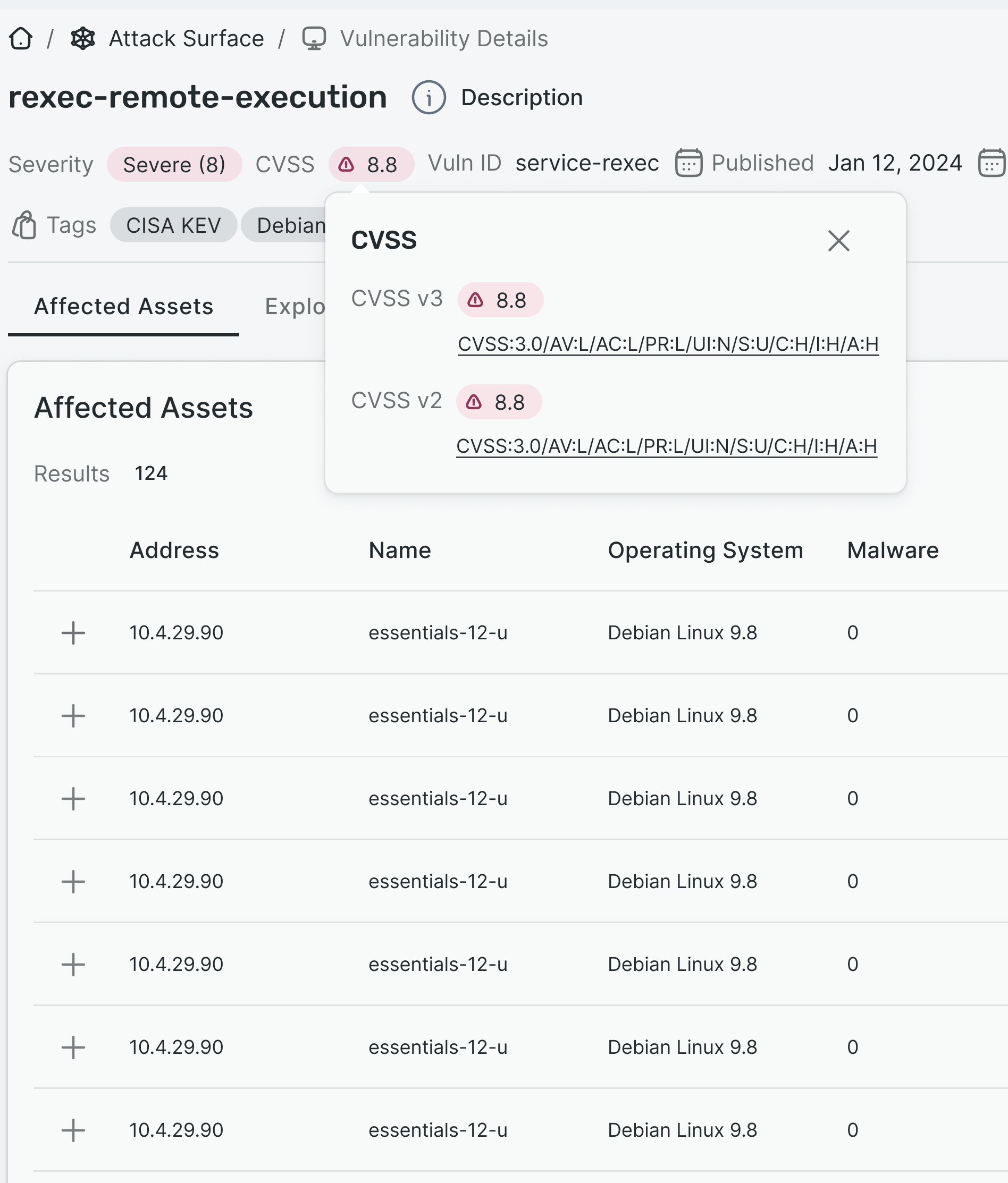
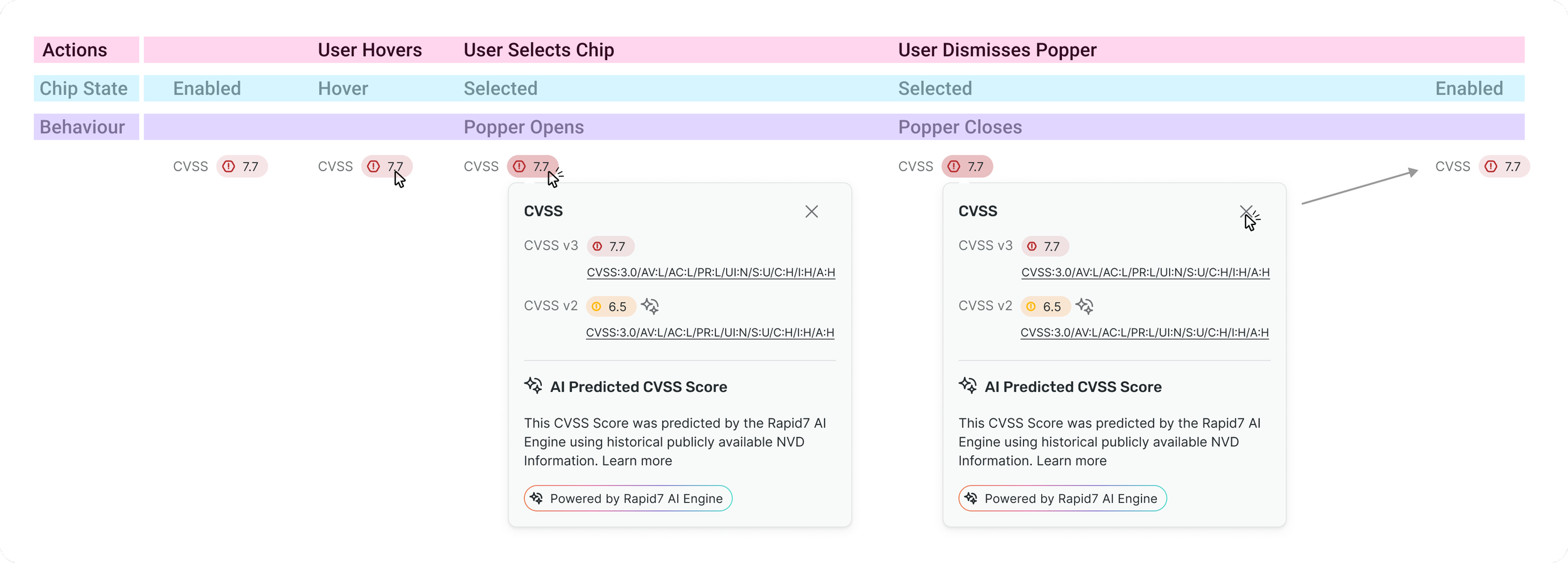
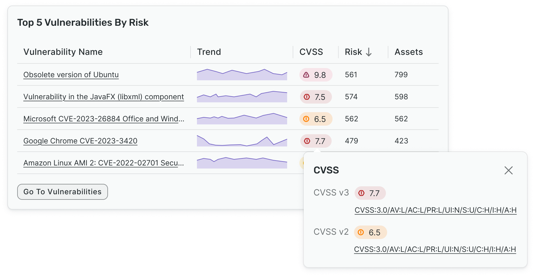
A Standardised CVSS Component
Always shows the latest CVSS version by default
Clicking the score opens a popover showing:
All available CVSS versions (v4, v3, v2, etc.)
Their full vector strings
Direct links to NVD for verification and transparency
This keeps the interface clean while still giving power users access to full detail.
This pattern can easily scale for AI disclosure for AI enhanced scoring.
I also proposed that CVSS scores should always include severity colour coding to:
Improve scannability in dense tables and lists
Help analysts instantly understand risk level
Reduce cognitive load during triage workflows
The Solution
The Outcome
An example of this pattern in a dashboard card context:
The proposal was approved as a global design pattern
It established a single source of truth for CVSS presentation across the platform
It removed long-standing UX inconsistencies across multiple products
It created a future-proof foundation for upcoming CVSS standards and AI scoring
Successes
Reflection
This project really enhanced my systems-level design thinking skills, particularly dealing with complex data. Designing for scale and long-term platform health was another key skill I developed in this project, a highly important skill in SaaS product design. In my unification attempt, I developed skills in creating patterns that work across many products, not just one screen